Learning, Accelerated.
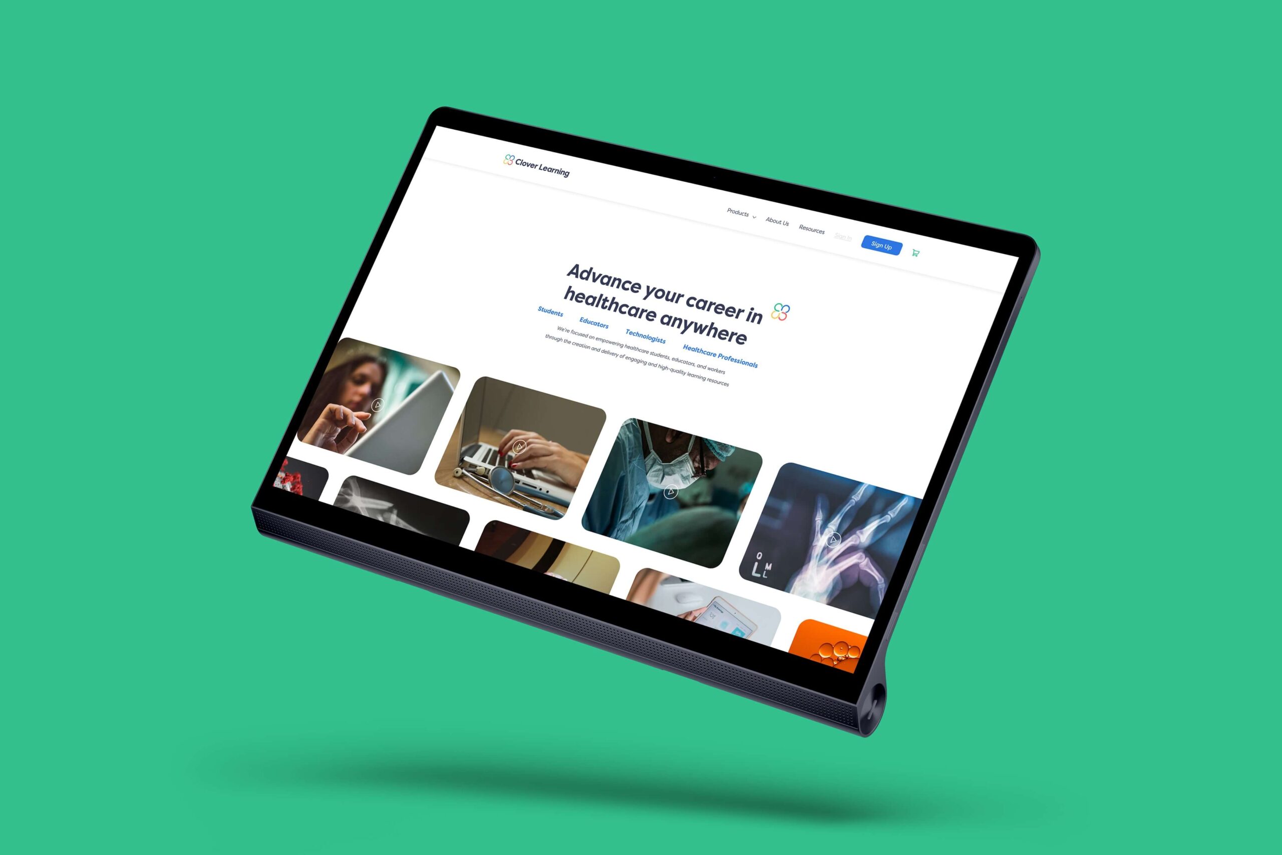
The design of Clover Learning’s online learning platform for radiologists and healthcare professionals was driven by a thorough understanding of their unique educational approach and gap in the market. Through user research and feedback, we identified key pain points such as the need for easily accessible and up-to-date content, interactive learning experiences, and a seamless interface tailored to their busy student schedules. To address these challenges, we prioritized a playful, simple and intuitive user interface with a thoughtful user experience, allowing students to quickly find relevant courses and resources. Additionally, we incorporated features such as personalized recommendations based on users’ interests and past activities, fostering a more engaging and efficient learning journey.
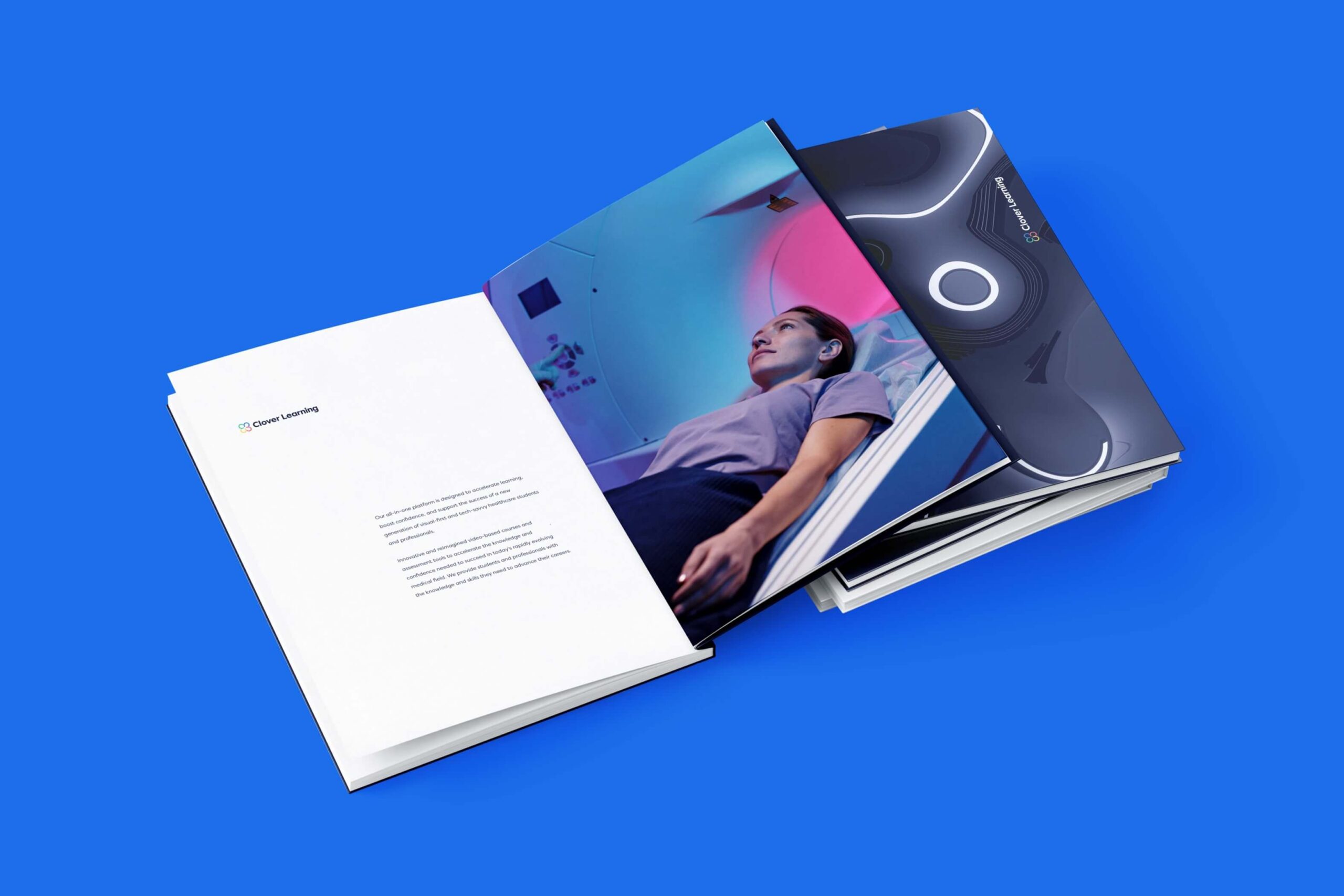
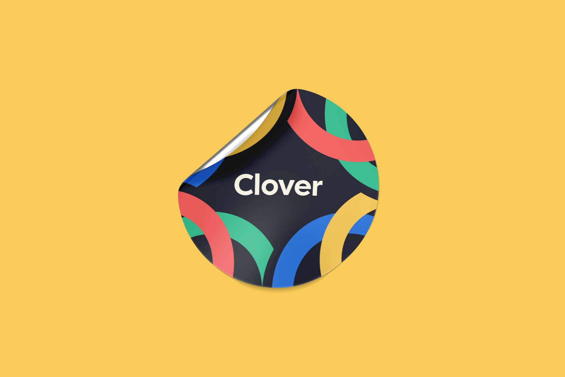
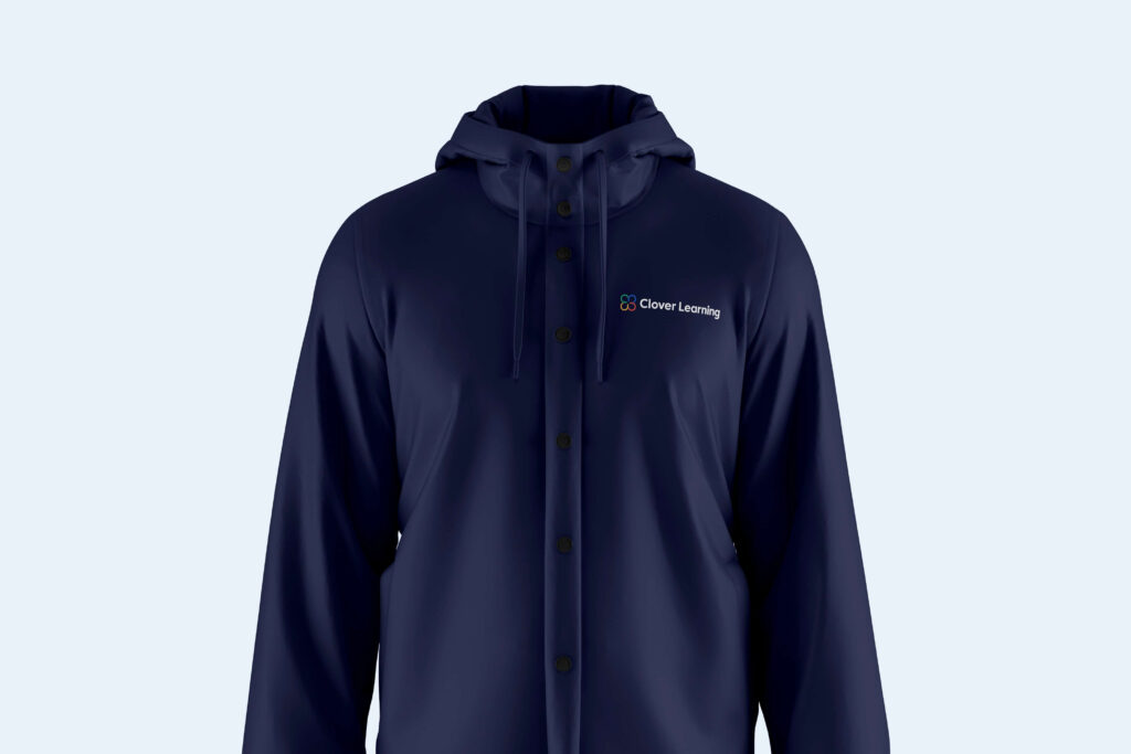
In terms of user experience, we focused on enhancing interactivity and engagement to optimize consumer retention. In developing a new brand identity, we held onto the brand story while elevating their approach to typography and color. By combining thoughtful U/I design with immersive U/X elements, we aimed to empower radiologists and healthcare professionals to dive head first into Clover Learning’s accessible, engaging, and effective educational experience.
