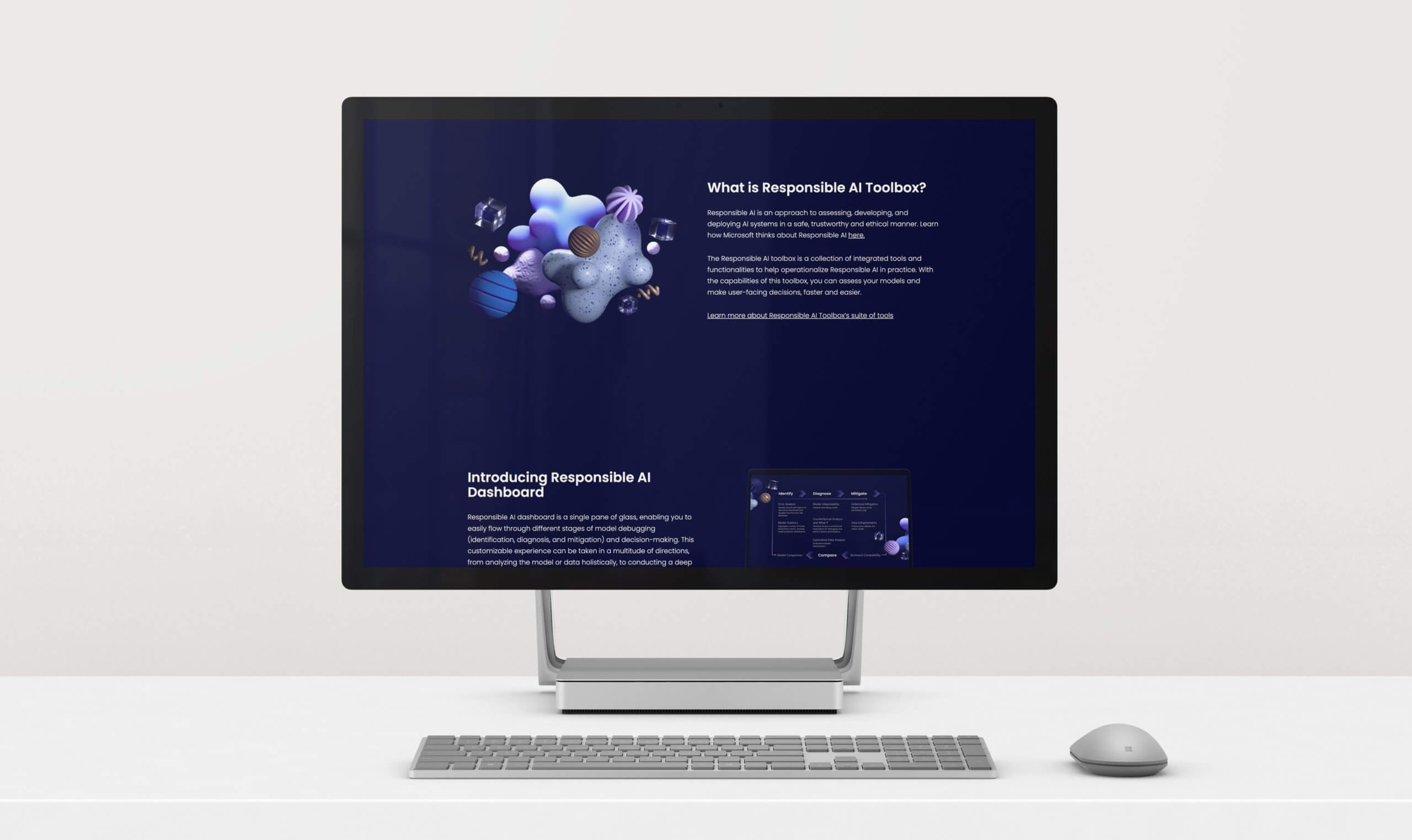
Responsible A.I. — Your way.
Microsoft’s Responsible A.I. team gave Authors and us the space necessary to float a vast array of creative strategies, before embarking on a vision that felt as light and approachable to use as the Responsible A.I. Toolbox itself — with the end goal of delivering an equitable solution to our global developer community.
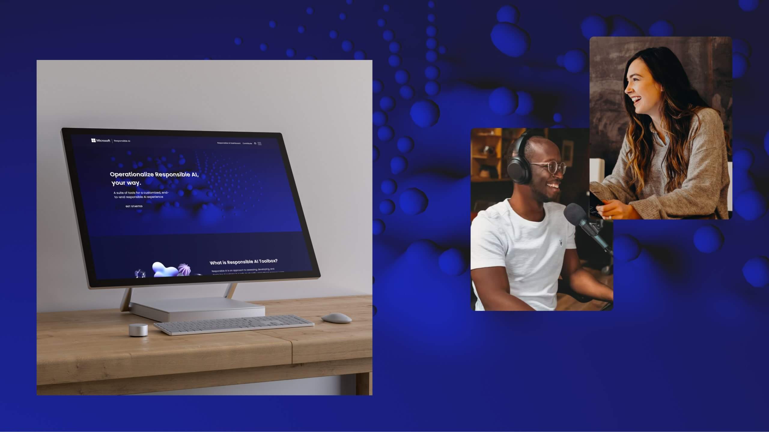
When we first began to began to explore the user flow necessary for the site, we understood that it needed to instrumentally useful, functional, and helpful. We needed an experience that helped guide users through complex terms and concepts without getting fatigued or distracted. Knowing the nuance and complexity of the content, we anticipated confusion and frustration in the learning process and worked to introduce the different tools, steps, and methodologies in a visibly differentiated way.
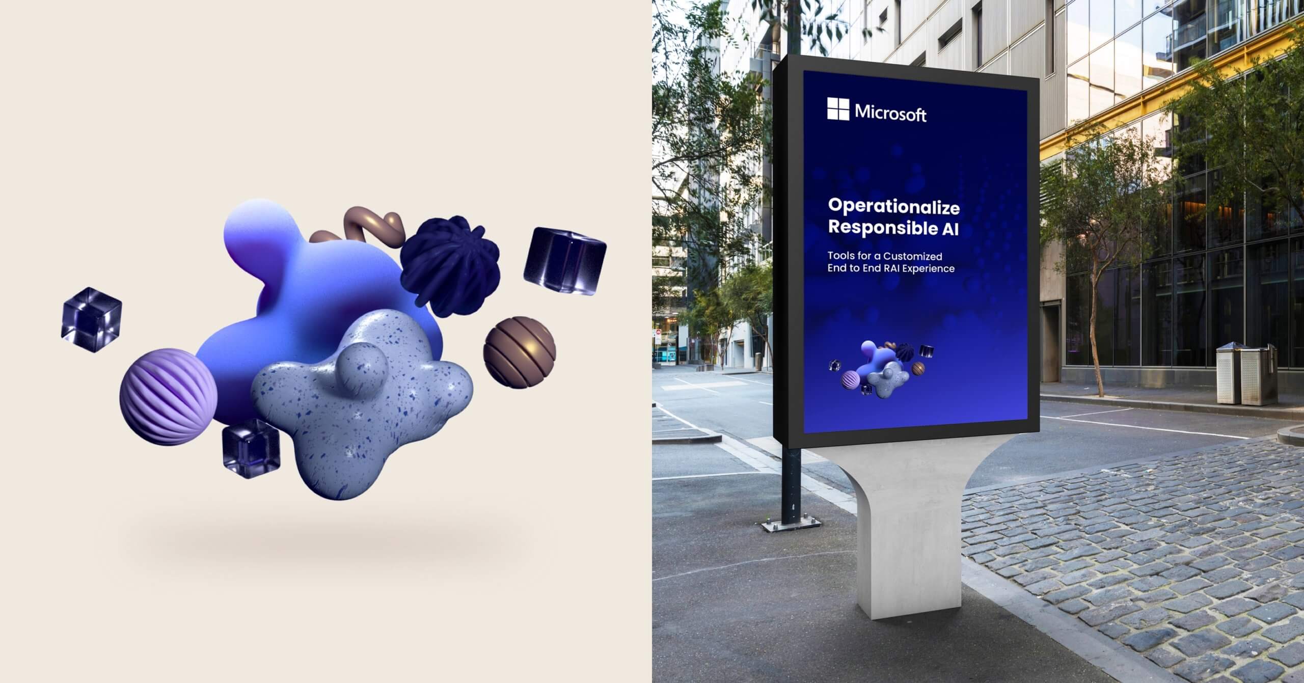
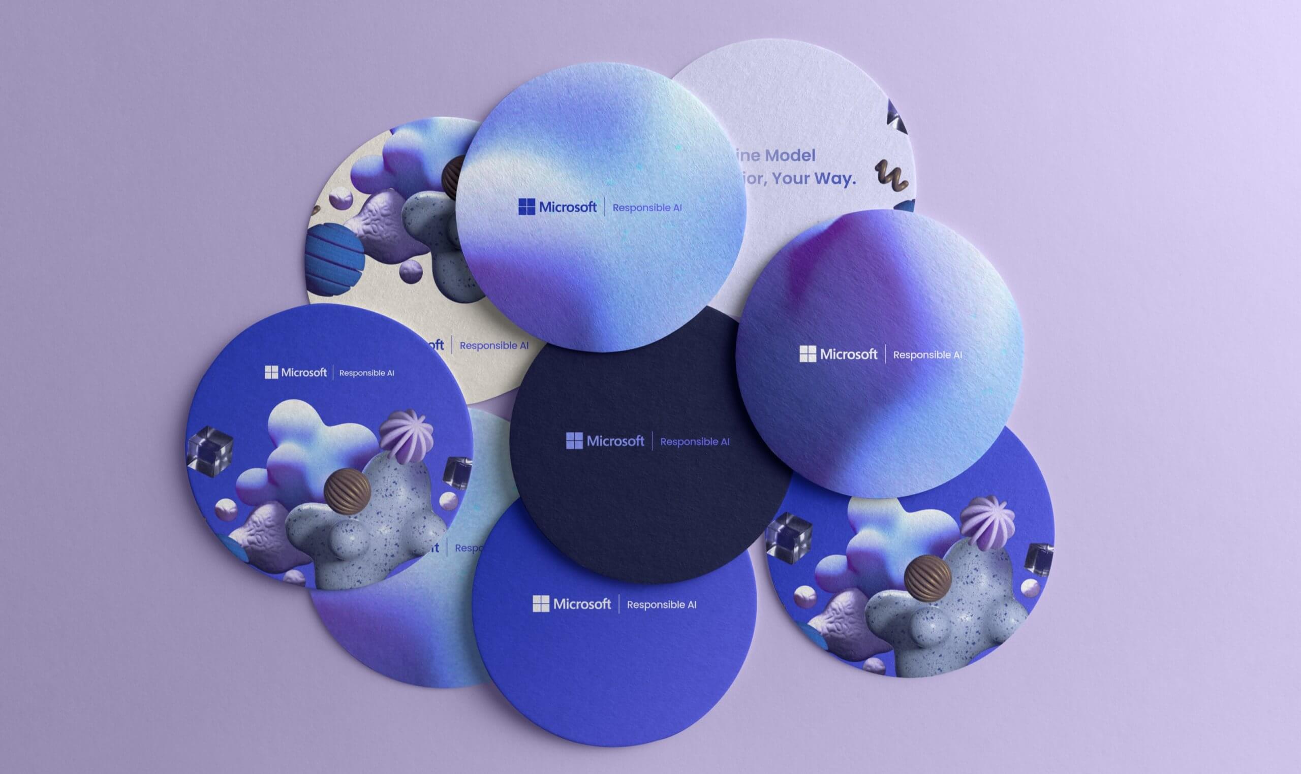
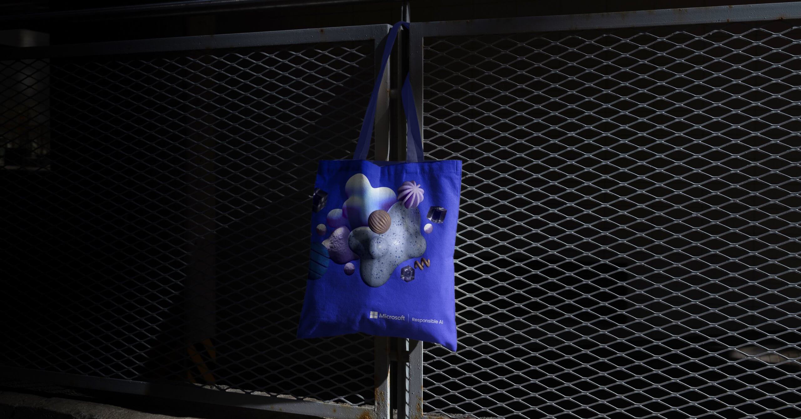
With the look and feel of the site we wanted to create something that would cater well to late night coding sessions and the ever more common dark mode beloved in the developer community. Welcoming and innovative was the objective, and not abrasive or heavy. Microsoft’s brand tones were helpful to lean in to being welcoming and calming, shifted in high gear to a neon palette with a hunt of fuschia to bring a fresh energy to the experience. The illustrative approach. brought an added angle to the creative, with abstract orbs and cylinders hovering together to present a beautiful view of our interconnected, data-driven, A.I.-fueled future through incredible 4d renderings.
You can visit the site here to learn more about the initiative.
